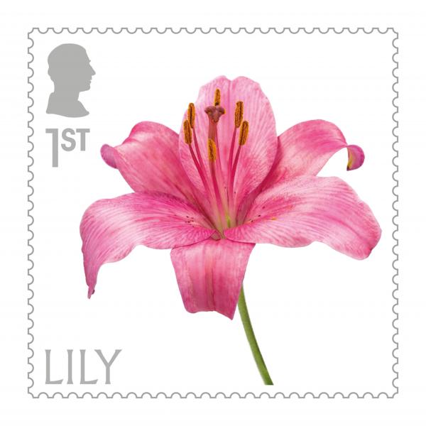
Royal Mail’s set of 10 stamps celebrating Flowers, released on March 23, is the first special issue carrying the new cameo portrait of King Charles III.
It’s the biggest commemorative stamp ever issued by Great Britain, and we think it’s also the best!
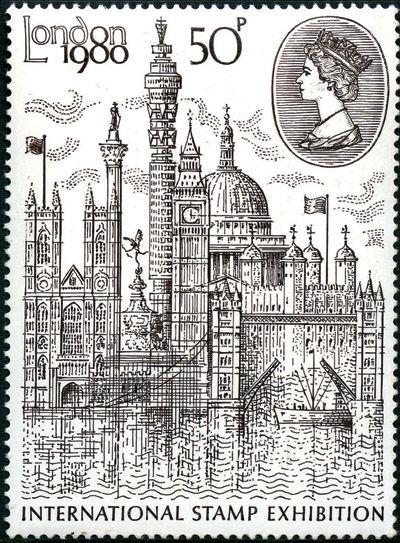
The 50p value issued for the London 1980 international stamp exhibition (whose logo appears in the top left corner) had an unusually large format, one which has never been used again.
And it made full use of this by offering an impressive montage of London landmarks, engraved in superb detail and attractively recess-printed in dark brown on white.
Below wispy clouds and an unusual reproduction of the Queen’s head in a cartouche, rising above the Thames we can clearly see (from left to right) Westminster Abbey, Nelson’s Column, the Shaftesbury Memorial fountain (statue of Eros) at Piccadilly Circus, the Post Office Tower, the Houses of Parliament’s Big Ben clocktower, St Paul’s Cathedral, Tower Bridge and the Tower of London.
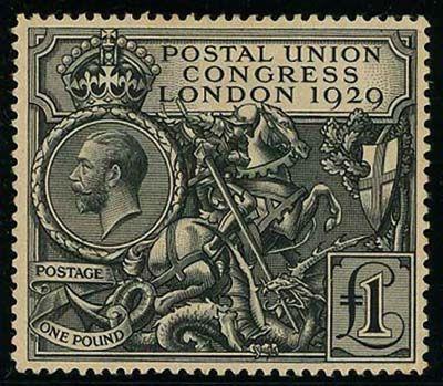
The first ever British stamp which could be called spectacular was the top value in a set of five issued to coincide with the ninth Congress of the Universal Postal Union in London.
It is still worshipped by collectors.
At the centre, engraved with amazing finess, is the figure of St George killing the dragon.
This wonder of elegance was the fifth essay produced by the designer to this particular remit, but it was well worth waiting for.
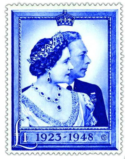
With its narrow frame and bevelled border, the high-value from the Royal Silver Wedding set of two is a stunningly handsome stamp.
A bold but distinguished design, based on a regal photograph by Dorothy Wilding, it resembles the photo-portraits of the King and Queen that many British families had on the walls of their lounges during the war years, in order to assert their national pride and keep up their spirits.
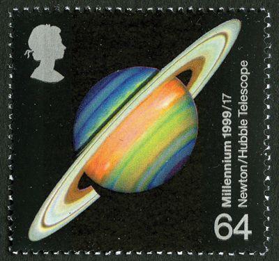
A stamp marking the development of the astronomical telescope as an achievement of the millennium, and name-checking Isaac Newton as a pioneer of the science, carried a very simple and yet absolutely breathtaking image.
It’s a photograph taken by the Hubble Space Telescope, presenting false-colour imagery of the gas giant Saturn, the most visibly dramatic planet in our solar system, against the backness of space.
The planet’s mysterious and fantastically complicated ring system, first observed by Galileo in 1610, is made up of ice, rock debris and dust, with the darker Encke gap caused by the presence of the tiny moon Pan between the inner and outer elements.
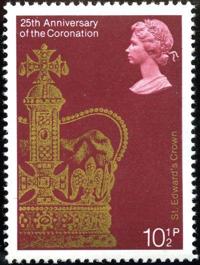
This stamp depicts a magnificent piece of regalia worn only once in any monarch’s lifetime: the solid gold St Edward’s Crown first used for the coronation of King Charles II, who had it made to replace the one destroyed by Oliver Cromwell.
Reproduced in gold and a very regal shade of red, the image is classier than it would have been if it had attempted to show the emeralds, rubies, sapphires and pearls which adorn the crown in full colour.
The glorious detail remains, including the cross pattées and fleurs-de-lis above the ermine border, the gold monde at the intersection of the arches and the jewelled cross atop it.
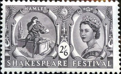
In an attempt to plug the hole it had punched in its traditional issuing policy, the GPO insisted this was not an issue honouring Shakespeare himself, whose 400th birthday it was, but one commemorating the Shakespeare Festival as an event.
Nevertheless, this was a ground-breaking and controversial issue, the first to depict a commoner.
In a multi-coloured set of five showing scenes from plays, the only recess-printed stamp, and the only one to name the play in question, was the monotone top value in deep slate purple illustrating the hapless Hamlet contemplating mortality.
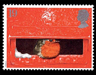
One of the most joyous Christmas issues ever took as its theme that beloved personality of the British winter, the robin redbreast.
Whilst four of the stamps were akin to Christmas card images, the lowest value was a gem.
Its simple beauty lies partly in the contrasts between the red of the postbox and that of the bird’s plumage, and between the silvery white of the smattering of snow and the silver of the Queen’s head.
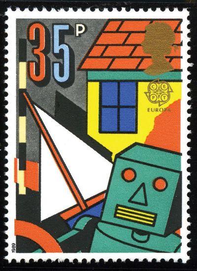
Until the Millennium series a decade later, few British issues were as revolutionary in design as this one addressing 1989’s Europa theme.
The design of each of the four stamps is bold, colourful and primitive, in this case depicting a number of traditional play objects including a doll’s house, a rigged yacht and a crude robot made out of a cardboard box.
The style is appropriately that of illustrations in a children’s book.