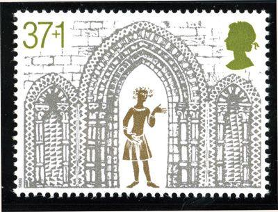
Amongst the most magnificent of all Christmas issues was the 1989 set of five celebrating important architectural features of Ely Cathedral in Cambridgeshire, on its 800th anniversary.
Stunning in gold and silver, it was also unusual in having a charity surcharge of 1p on four of the five values.
The 37+1p shows the Triple Arch from the West Front of the cathedral, in silver, within which is a golden figure with exaggerated features, possibly inspired by the carvings on misericords inside the building.
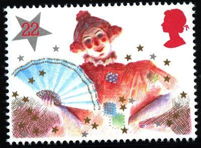
The Christmas issue of 1985 took the great British institution of pantomime as its theme, with the 22p presenting that jolliest of characters, the dame.
All the typical characteristics of the role are included: the ridiculous highly coloured wig, the rosy cheeks and nose, the flouncy padded dress, the fan behind which ‘she’ (the dame is traditionally played by a man) will make mildly rude asides to the audience, and the assertive attitude suggested by the left arm akimbo.
Dusted with stars and sparkle, this design sums up the fun of going to the panto.
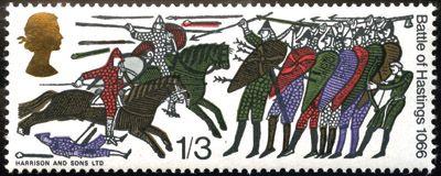
Showing scenes from the Bayeaux Tapestry, the stamps marking the 900th anniversary of the battle that secured the Norman Conquest were truly astonishing in their day.
The 4d values provided Great Britain’s first ever se-tenant strip of six, but arguably the stars of the show were the two higher values, both of which had the new cameo Queen’s head embossed in gold.
The 1s 3d top value was also of extra-wide format, allowing one scene of combat to be presented on a single stamp in all its primitive energy.
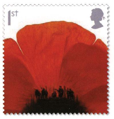
The second of a series of three poppy designs in the Lest We Forget series, from a miniature sheet commemorating the Battle of Passchendaele in 1917, is dominated by the intense red of the flower, almost like a spreading pool of blood.
A closer look at the black stamen reveals a group of soldiers going over the top, advancing through what was a once a grove of trees, now reduced to broken stumps.
This is a very potent image indeed, as we realise that, like half a million men in the bloody battle, they are leaving us, never to return.
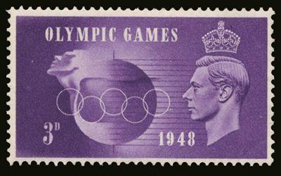
The four designs issued on the day of the opening ceremony of the Olympic Games in London do not sit well as a set, but the 3d violet was the most dynamic and original.
The aptly named designer adopted a poster art approach, showing an athlete’s head pushing ahead out of a globe, apparently straining for the finish line.
The parallel lines trailing behind him also suggest speed, and variations in the background shade suggest the transition from day to night in what was the first global sports festival since the end of World War II.
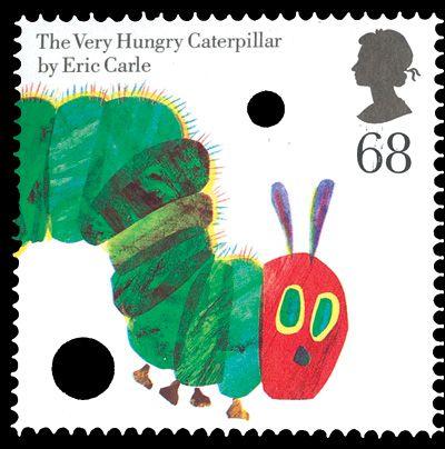
One of eight stamps in a joint issue with the USA – but one of only two designs which were used in both countries’ sets – the Very Hungry Caterpillar 68p is unique among British stamps in having die-cut holes deliberately incorporated into it.
American writer and illustrator Eric Carle made his name in 1969 with his tale about the cute little creature that likes biting holes in things, and it has become very popular with parents teaching young children to read simple words.
Sadly, the US version of this stamp did not have holes, which makes it much less eye-catching!
Design: Rose Design.
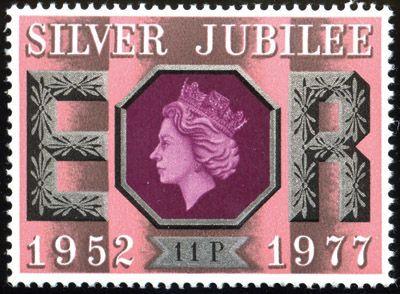
Britain’s second ever royal silver jubilee set strongly echoes the first, for George V in 1935, and harking back to another era is a clever way to suggest a sense of continuity.
This issue, however, rather more ostentatiously screams ‘silver’ – in the value frame, in the hexagonal cartouche for the Queen’s head and in the floral decorated capitals ‘ER’ – with a three-dimensional effect making them stand out still further.
The 11p value is particularly pleasing, with its rose pink and grey background suggesting rich satin curtains, and the deep magenta colour used for the Queen’s head extremely rare in a commemorative.
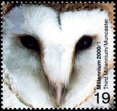
Another of the stunning photographic essays used for the Millennium series, this one takes as its subject the heart-shaped face of the common barn owl.
Owls always seem inscrutable, but this one from the World Owl Trust sanctuary at Muncaster seems to be looking into the lens with complete disdain.
Alternative nicknames for the species, such as ‘demon owl’, ‘ghost owl’ or ‘hobgoblin owl’, seem very apt when you are confronted by such a stare.
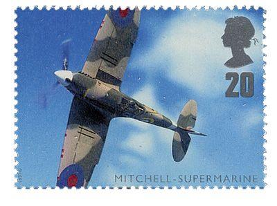
If the picture concealed in the hide of the cow in the Patients’ Tale stamp (see No23) was subtle, the optical illusion here is even more so.
The eye is drawn by the iconic image of the Supermarine Spitfire banking against a cloudy sky.
But look closer and you realise that the clouds are not just random shapes, but form the profile of the great aeronautical engineer who designed the plane, Reginald J Mitchell.
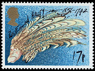
The appearance of Halley’s Comet in the night sky, hailed as a ‘maybe twice in a lifetime’ event, was celebrated internationally on stamps, but nowhere in such an original way as in Britain.
Not for Royal Mail the unimaginative approach of showing a portrait of Edmond Halley, historical illustrations of the comet or photographs of the probes sent to study it.
Instead, a caricaturist was commissioned to design four colourful but crazy images.
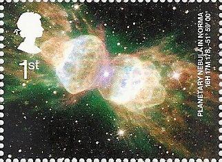
Using photography might be a ‘lazy’ approach to design, but a stunning photo can still make a great stamp.
A fine example is the lower left of the quartet in the Astronomy miniature sheet.
It depicts the Ant Nebula, a young bipolar planetary nebula in the constellation of Norma in the southern Milky Way, with its stupendous glowing spherical shells of gas and plasma, the residue of dead stars.
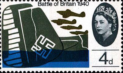
No stamp issue of the 1960s was as spectacular and controversial as the set marking the 25th anniversary of the conflict in which so much was owed by so many to so few.
For the first time, six different designs were combined in the same sheet.
Even more amazingly, four of them had silhouettes of Germany’s defeated aircraft alongside Britain’s victorious fighters and the Queen’s head.
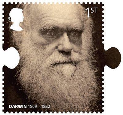
Following the lead given by the Beatles stamps (see No28), the Charles Darwin set took further advantage of the versatility of die-cutting by way of jigsaw-shaped designs, alluding to the great naturalist’s thinking as he tried to work out how all life fits together.
Particular amusement can be had by juxtaposing the portrait on the 1st class stamp with the 81p value’s depiction of an orang-utan from the same angle.
Their similarly grizzled, similarly hairy faces remind us of the fun caricaturists had in Victorian times, when the idea that humans were descended from apes was shocking.
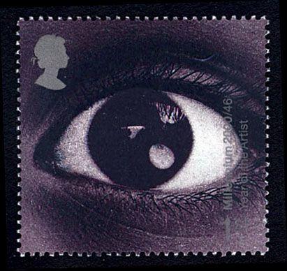
Eye-catching in every sense of the word, this stamp celebrated the Year of the Artist by showing nothing more than an amazing close-up of the one organ which is absolutely necessary for an observational artist.
It caused great excitement in some circles when it was suggested the centre of the eye had a tiny image of the starship Enterprise (from the cult science fiction series Star Trek) orbiting the Earth.
And with a little imagination you can easily see why that was suggested.