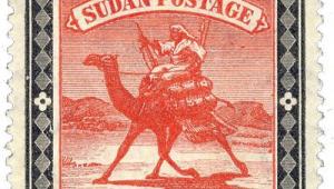
Natal: Last but not least
Between 1848 and 1851, more than 43,000 Britons settled in Natal, as Durban became a flourishing centre of trade in southern Africa. By 1857 the colony duly got its first postage stamps, in the unusual form of embossed impressions in plain relief on coloured paper.
Two years later these were replaced by recess-printed stamps making use of the well-known Chalon portrait of Queen Victoria. It was an elegant design but one which was far from unique to Natal, borrowing from the existing stamps of New Zealand and Tasmania, and later being comprehensively copied by those of Grenada.
When the era of surface printing dawned, Natal’s designs were initially uninspired – so much so that the unloved 1874 series has been described as ‘five ways of saying the same thing indifferently’.
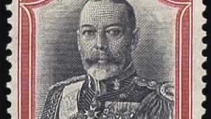
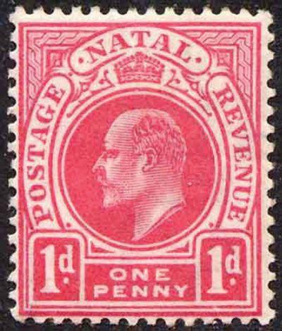
To its credit, however, British-baed printer De La Rue eventually remedied the situation for Natal’s last throw of the dice, in 1902. The colony’s final set of stamps as a separate political entity can justifiably claim to be its most distinctive.
There were 20 stamps in the series, printed in typography in a range of bright colours (most of the values being bicoloured), on paper with the Crown CA or Crown CC watermark. All were intended as dual-purpose stamps, and were duly inscribed ‘Postage Revenue’.
The design was generally considered very successful, with the bold outlines of the lower values in particular, from ½d to 4s, giving them a substantial, utilitarian feel.
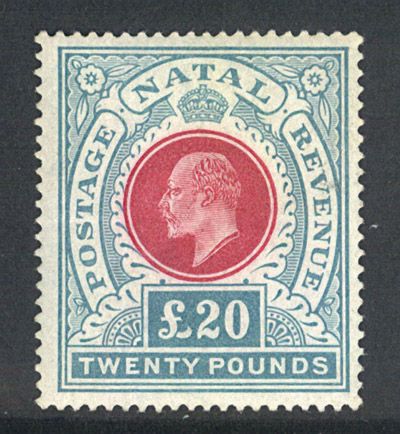
It was still a commonly held view that high values, in this case ranging from 5s up to £20, should necessarily be more elaborate, and to an extent they suffered from being over-fussy. Given that they had a larger format, but used the royal portrait at the same size, the almost inevitable result was myriad spandrels, foliage and floral embellishments, which do not always enhance the firm lines necessary to support the King’s head in a solid background.
However, a more serious weakness of the high values lay in the fact that fiscally used examples could all too easily be cleaned of their pen cancellations, and either be reused for postal purposes or given a false postmark and offered as a philatelic item. Catalogues include specific warnings about these fakes.
A drawback with the series as a whole lay in the fact that a joint postage and revenue issue requires a careful division of sales income between the Post Office and the Treasury, and clearly these calculations created some difficulties.
From 1908, all values between 6d and £1 were reprinted with the inscription ‘Postage Postage’, leaving only the lowest values as dual-use stamps.
By now, printing was on paper with the Multiple Crown CA watermark. Experiments with the use of fugitive inks and printing in reverse colours were just commencing when the colony was swept into the Union of South Africa in 1910.