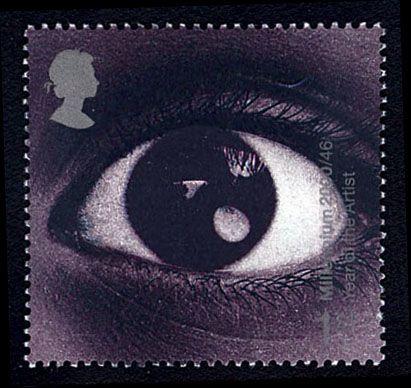
Eye-catching in every sense of the word, this stamp celebrated the Year of the Artist by showing nothing more than an amazing close-up of the one organ which is absolutely necessary for an observational artist.
It caused great excitement in some circles when it was suggested the centre of the eye had a tiny image of the starship Enterprise (from the cult science fiction series Star Trek) orbiting the Earth.
And with a little imagination you can easily see why that was suggested.
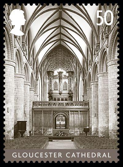
Although it was based on a simple photographic treatment, the Cathedrals issue was a stunning set.
As with all its fellows, the stamp of Gloucester Cathedral looks down the nave to give a wonderful sense of the dimensions of this impressive Gothic building.
The decision to eschew full colour in favour of monochrome was inspired.
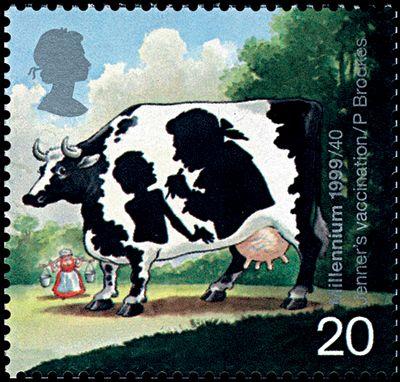
Commemorating Dr Edward Jenner’s invention of a defence against smallpox in the 18th century, this stamp cleverly alludes to a folkloric tale and involves a very subtle optical illusion.
It was from the knowledge that milkmaids did not contract smallpox if they had previously suffered from cowpox that Jenner developed his ‘vaccine’ (the word comes from the Latin for ‘cow’) containing material from cowpox sores.
Accordingly, the design shows a caricature of a Friesian cow, whose black and white markings contain a silhouette of the doctor vaccinating a child.
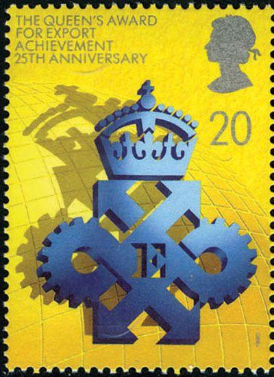
Celebrating the 25th anniversary of the Queen’s Awards for Export and Technology, were four very bold stamps realised in dark blue and yellow, in similar format and available in se-tenant pairs.
At the heart of this stamp is the Export award’s crowned insignia, with an ‘E’ at the centre of four arrows growing out of the cogwheels of industry.
This casts a shadow over a stylised globe symbolic of international trade.
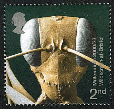
This arresting illustration is the work of Wildscreen at-Bristol, an educational charity which became a Millennium Project, working to promote our appreciation of biodiversity through wildlife imagery.
It looks like something out of a science fiction film, but is simply a beautifully lit photograph of the head of an ant, at huge magnification, showing its eyes, antennae, mouth and ‘whiskers’ in the finest detail.
Most eye-catching of all is the smile the ant appears to have as it glares into the lens!
Design: GettyOne Stone.
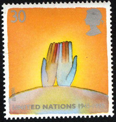
One of two stamps celebrating the 50th anniversary of the United Nations, from a set on the theme of peace, this design uses simple imagery to make a telling point.
Two open hands, suggesting no malice, with fingers of different colours, representing all mankind, emerge from the globe in supplication to the background of heat and flames, alluding to conflict.
It looks like a thought-provoking piece of modern art, rather than merely a postage stamp.
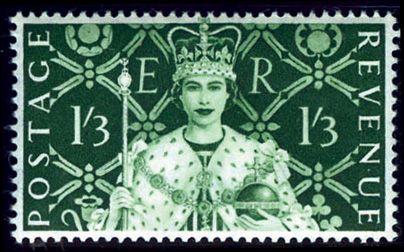
The most elegant of all the early Queen Elizabeth II commemoratives was created by a French-born artist who remains one of the most famous stamp designers ever.
Strikingly, it was the only stamp in the Coronation set of four, and indeed the only postage stamp of the reign until 1966, which did not adopt the Wilding portrait.
Instead, it defied convention by showing the Queen full-face, in Coronation robes with the orb and sceptre, against the background of a Tudor tapestry containing symbols of the nations of the United Kingdom.
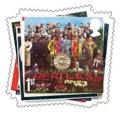
A set of six aimed at stamp collectors and Beatles aficionados alike used album covers as its artwork, which could be considered the lazy option.
However, making it a self-adhesive issue allowed Royal Mail to experiment with asymmetric perforations, which it cleverly used to suggest a pile of LPs casually arranged.
And on top in this case is the revered Sgt Pepper’s Lonely Hearts Club Band, whose sleeve design is iconic in its own right, with its montage of celebrity faces, including those of writers, musicians, film stars and Indian gurus.
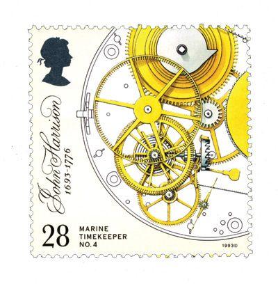
From one of the most detailed sets ever, celebrating Harrison as the inventor of the marine chronometer, the 28p shows the escapement, remontoire and fusée of his marine timekeeper No4 in all its intricate glory.
Made in 1759, this allowed navigators to work out their longitude wherever they were, boosting global exploration and thus the British Empire.
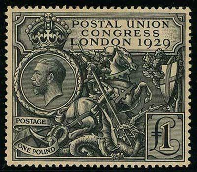
The first ever British stamp which could be called spectacular was the top value in a set of five issued to coincide with the ninth Congress of the Universal Postal Union in London.
It is still worshipped by collectors.
At the centre, engraved with amazing finess, is the figure of St George killing the dragon.
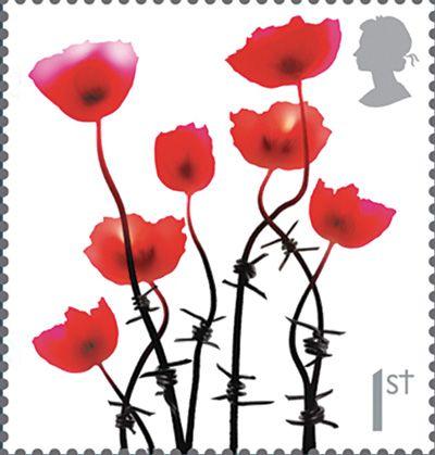
This was the first of a series of three ‘poppy’ designs commemorating events in World War I (in this case the Battle of the Somme), initially available only within a miniature sheet but later re-released in counter sheets.
Seven beautiful tall red poppies seem to weave their way plaintively into the sky, and then we notice that their stems are made of barbed wire, a moving metaphor which requires no further explanation.
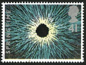
In stark contrast to the preceeding sets devoted to the other three seasons, all five values in the 1995 Springtime issue were designed to puzzle the viewer on first appearance.
In that, the highest value succeeds especially well! Is it a representation of the Sun in computer-altered colours? A black hole? Part of an eye? Some psychedelic vision induced by drugs? Not quite, but it is grass!
It’s a very effective photographic essay showing hundreds of fresh green blades, with white stems, laid around a central void in a starburst pattern to suggest the growing season exploding into action.
It takes the breath away, as no simple lawn could ever hope to do.
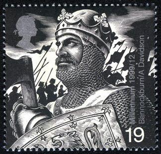
A remarkably masculine stamp, and the most warlike ever issued by Great Britain, depicts Robert the Bruce, King of Scots, at the place where he changed the history of his nation, Bannockburn in 1314.
The image, which seems to have been inspired by C Pilkington Jackson’s equestrian statue at the battle site, is of a king ready for war, resolute in expression, resplendent in helmet and chainmail and with axe in hand.
In the background, silhouetted infantry wielding pikes and cavalry bearing standards prepare to see off the English foe under a darkening sky.
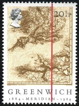
The centenary of the international conference which met in 1884 to decide a universal system of longitude was marked by four classy stamps, each with the 0° meridian shown dramatically by a bold red line across the design.
On the best of the four, it is superimposed on a historical but very detailed sepia map of the south of England and north-west of France.
Even the most basic of inscriptions seems superfluous, because the illustration says it all.