Turks & Caicos: A pinch of salt
Stamps depicting the seal of a colony seemed to be a favourite recommendation of Colonial Secretaries in the late 19th century. Instructions to the Crown Agents frequently urged the use of a single design with a central device to convey the badge.
Precisely this approach was suggested for the first combined issue of the Turks & Caicos Islands in 1900, and the result was something of a classic in conveying the economic raison d’être of one of the least heralded corners of the Empire.
Located at the southernmost edge of the Bahamas archipelago and often known as the Salt Islands, both groups of islands were uninhabited until the late 17th century. It was salt-rakers from Bermuda who changed all that, establishing the first settlement on Grand Turk island after finding that its shallow seas and arid climate made salt extraction easier than elsewhere.
Salt was a precious commodity at the time. The cargo was shipped to the east coast of America, especially New England and Newfoundland, where it was used to preserve cod.
It was therefore the root of a long battle for control of the islands between Bermuda and the Bahamas, and later by France, Spain and Britain, until in 1848 the islands were made a British colony, subsequently a dependency of Jamaica.
The Turks Islands issued stamps from 1867 and became a firm favourite with philatelists due to the numerous local surcharges applied in 1881. The Caicos Islands had yet to make their philatelic debut when, in 1900, the two chains proclaimed a new level of independence with a joint issue.
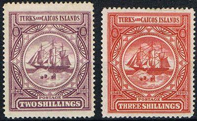
London-based printer De La Rue was commissioned to produce seven low values from ½d up to 1s, which would be printed on Crown CA watermarked paper, and two larger-format higher values of 2s and 3s, which would be on Crown CC paper.
Both designs carried the same central illustration based on the badge of the colony, which depicted a three-masted barque anchored offshore with salt rakers eagerly at work on the foreshore.
De La Rue had its work cut out in conveying this in such a limited space, along with a long colonial name, the value tablet and the dates ‘1848’ (referring to the start of British rule) and ‘1900’ (the date of issue), and all the other necessary embellishments.
The result could easily have been overcrowded and fussy, but that possibility was skilfully avoided by the engraver and real balance achieved, especially on the attractive high values.
The circular badge emphasises the features of the vessel, rather than the industry, while the eight-pointed engrailed device directs the eye to the significant dates, or to a pair of discreet Turks-head cacti – the local flora from which both island chains draw their names.
The name tablet and value tablet are elegantly lettered, and frame the design neatly at the top and bottom.
It was a distinguished philatelic debut for the Turks & Caicos – and its quality was only emphasised by the rather less elegant adaptation of the low-value design for the Centenary of Separation from the Bahamas commemorative in 1948.