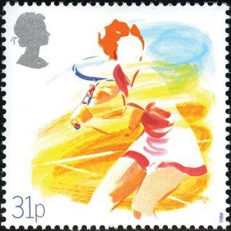
One of a set of four marking the anniversaries of various sporting bodies, this stamp takes an original approach to the problem of suggesting power and motion, the sine qua non of sporting issues.
In glorious colour, redolent of a British summer, it depicts an anonymous female tennis player about to play a backhand shot on a cinder court.
With racket at shoulder height, and the impression of tensions in her legs and body, the energy of her movement is further suggested by a swirling background.
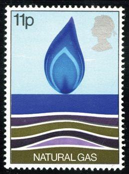
Some of the most stunning stamps are the simplest, and here is a case in point.
It takes the classic image of a gas flame, very well known to millions of homes in the late 1970s, and places it on the calm surface of a stylised North Sea.
Beneath the surface lie the strata of sediment which contain the crude oil from which the gas will be refined.
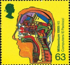
In the first of the Millennium series, the highest value took as its subject the development of computers, commemorating in particular the work of Alan Turing.
A cross-section of a human head has various pieces of computing hardware laid out as if inside a machine, reminding us that the brain itself is a very complex computer, which it had to be to invent the computer!
Design: Sir Eduardo Paolozzi.
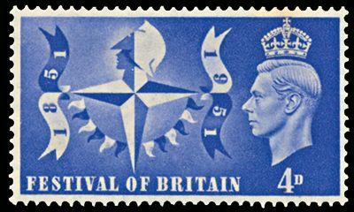
Organised only half a dozen years after the end of World War II, the Festival of Britain was intended to mark the centenary of the Great Exhibition of 1851, but also a dawning optimism about the country’s future as it struggled to recover from the ravages of war.
Pavilions were erected along the South Bank of the Thames to put the whole country on show to the world, and two stamps were issued.
The higher value has the official logo of the Festival, comprising a compass rose with a stylised Britannia’s head, adorned with bunting in the form of suspended flags and a string of pennants.
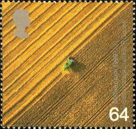
This is a stunning image, apparently bisected diagonally with half of the pictured crop harvested and the combine harvester centred perfectly.
But there’s a remarkable utility behind it too.
An orbiting satellite produced the awesome, golden image, and this ‘remote sensing technology’ helps modern farmers to learn how productive different parts of their land are, so they can respond with appropriate use of chemicals, keeping their approach as environmentally friendly as possible.
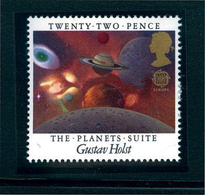
This beautiful stamp for European Music Year celebrates one of the greatest pieces of British music, Gustav Holst’s seven-part orchestral Planets Suite, by trying to capture the beauty of the heavens.
Like the music, the design has real depth.
In the centre are Jupiter, the unmistakable ringed Saturn and the small red orb of Mars.
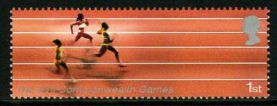
This oblong format was in vogue early in the 21st century, and proved particularly appropriate for the set issued to mark Manchester’s hosting of the 17th Commonwealth Games in 2002.
Its success lies in the way it provides extra scope for evoking a sense of speed in each of the five events illustrated.
On the athletics stamp we see three slightly burred female sprinters heading for the finish line.
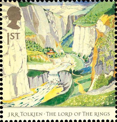
Whilst other postal authorities cashed in on the series of feature films, Royal Mail came up with something much more tasteful to celebrate the 50th anniversary of the publication of the first two novels in J R R Tolkien’s Lord Of The Rings trilogy.
Its stamps were created from original designs by the revered author himself, and his son Christopher.
Every one of the 10 designs is a treasure, but the loveliest is that showing Rivendell, the serene Elven outpost in Middle Earth.
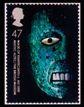
The 250th anniversary of the British Museum was celebrated by a striking set of five amazing photographs of statues or masks, all with one eye staring starkly out from a shadowy background.
Most menacingly, the 47p value has the 600-year-old Mixtec-Aztec regalia mask of Xiuhtecuhtli, the Mexican firegod.
The shining turquoise of its mosaic pattern makes it visually stunning, and the white eye and teeth contrast with this to complete a face you won’t forget in a hurry.
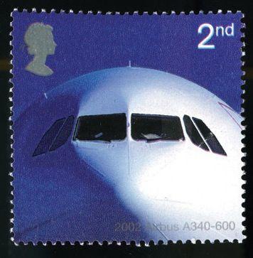
There is no doubting which was the most arresting stamp in the set of five commemorating 50 years of passenger jet aviation.
A beautifully lit photo-essay features the ‘face’ of a contemporary Airbus A340-600, staring back at the viewer like some benevolent monster.
The bulk of the aircraft, which can carry almost 400 people, is not illustrated but is clearly suggested by its massive head, standing out magnificently against an indigo clear sky.
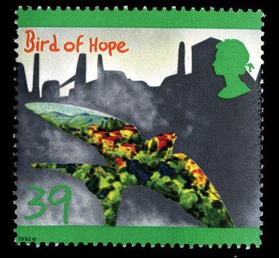
Like No50 in our countdown, this stamp was issued as a result of a competition run by television’s Blue Peter programme.
But in this case the design brief was much more complicated: children were asked for ideas with an environmental message.
Alice Newton-Mold, aged 12, painted the Bird of Hope, ingeniously showing shining modern homes and green trees apparently being regenerated from grey industrial wasteland as the bird flies over them.
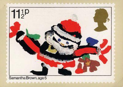
Have you ever seen a jollier Father Christmas than the one realised by five-year-old Samantha Brown, the youngest ever designer of a British stamp?
One result of a competition on BBC Television’s Blue Peter programme, which attracted a staggering 74,000 entries and resulted in a set of five very different designs, Samantha’s glorious Santa beams at us with beady eyes, holding his arms wide with presents falling all around him.
Unencumbered by any other design detail, he is the total focus of our attention, and is he not the epitome of a toddler’s idea of Father Christmas: happy, cuddly, brightly coloured and full of surprises?
Design: Samantha Brown.
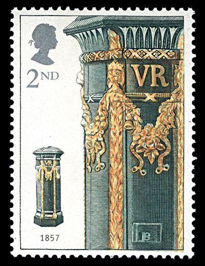
In a year dominated by modern-looking issues, one that stood out was a more traditional one marking the 150th anniversary of the pillar box by showing its development through the years.
The star of this very elegant set of five, based on engravings by the celebrated Czeslaw Slania, was the 2nd class NVI depicting a light green Victorian box with a fantastic array of golden decoration.
Apparently this embellishment was exclusive to the capital cities of England, Scotland and Ireland, in contrast to the plain ‘economy’ version seen everywhere else.