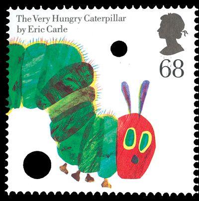
One of eight stamps in a joint issue with the USA – but one of only two designs which were used in both countries’ sets – the Very Hungry Caterpillar 68p is unique among British stamps in having die-cut holes deliberately incorporated into it.
American writer and illustrator Eric Carle made his name in 1969 with his tale about the cute little creature that likes biting holes in things, and it has become very popular with parents teaching young children to read simple words.
Sadly, the US version of this stamp did not have holes, which makes it much less eye-catching!
Design: Rose Design.
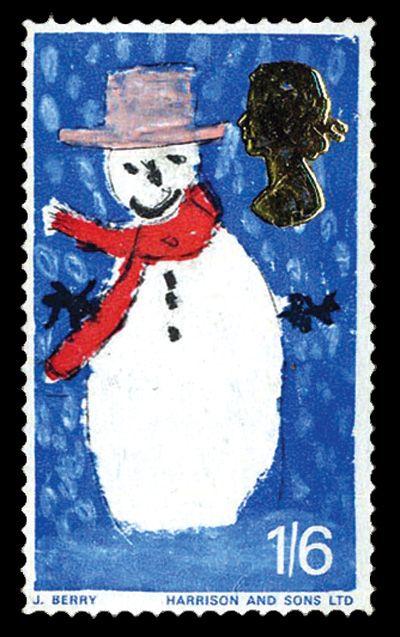
Britain’s very memorable first Christmas stamps were the result of a ground-breaking design competition limited to children under 16.
Six-year-old James Berry of Beckenham painted a jolly snowman in a blizzard, and his 1s 6d stamp, with the Queen’s head die-stamped in gold foil, remains one of the most recognisable ever.
When we first saw the stamps, many of us were appalled.
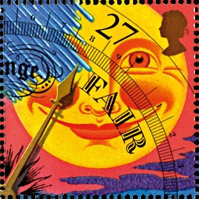
The four values in the Weather set are designed to be viewed as a group, completing the circular face of a barometer, and this is best seen in the format of the miniature sheet, which is itself circular.
The set is a veritable riot of colour and amusement, with many intriguing design elements which repay closer study, such as cats and dogs falling from the sky in the 19p.
But most striking of all is the 27p value, hinting at fair weather by way of a smiley-faced sun, with the value denominator doubling as a pressure gauge.
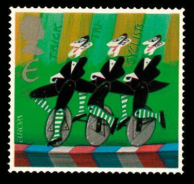
The 2002 Europa theme of the circus must have given designers all over the continent great fun, and was certainly a spectacular series to collect.
Britain’s predominantly greenish set of five stamps concentrated on stereotypical elements of the big top, and our favourite is the Trick Tricyclists design, with its three identical and rather po-faced monocyclists.
One curiosity, immediately beneath the Queen’s head, is the value ‘E’ (for the European letter rate) represented as ‘€’.
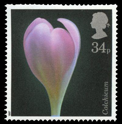
Many modern British stamps have been criticised for being essentially a photograph with the Queen’s head and inscription added, and that’s just what this one is.
But what a stunner!
A single specimen of autumn crocus is lit classically against a black background, highlighting the stem and flower’s varying hues of light green, purple, puce and white.
The colours combine with the angle of the petals to the lens, suggesting a raised hand, to make this a breathtaking composition.
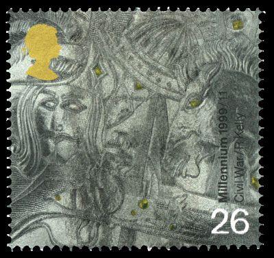
So many stamps were produced in the Millennium series of 1999-2000 that collectors were overwhelmed – and perhaps irritated.
As a result, some wonderful designs have gone largely ignored.
The dominant stamp in the military set, entitled The Soldiers’ Tale, was the 19p depicting Robert the Bruce, but the striking 26p devoted to the English Civil War is a hidden gem, requiring more careful study to appreciate its intricacies.
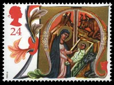
One of the most stunning Christmas sets was based on illuminated letters from the Acts of Mary & Joseph, a medieval Italian manuscript housed in Oxford University’s Bodleian Library.
The 24p value shows the Virgin Mary looking at the baby Jesus, who has a startlingly adult face, lying in a stall in the manager with a humble beast of the field looking on through the open window.
The golden and red tones of the stamp, and the oak leaf border of the letter ‘M’ (for Maria), make this an appropriately rich and beautiful philatelic essay.
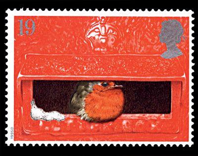
One of the most joyous Christmas issues ever took as its theme that beloved personality of the British winter, the robin redbreast.
Whilst four of the stamps were akin to Christmas card images, the lowest value was a gem.
Its simple beauty lies partly in the contrasts between the red of the postbox and that of the bird’s plumage, and between the silvery white of the smattering of snow and the silver of the Queen’s head.
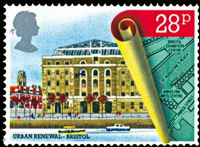
To mark the 150th anniversaries of the Royal Institute of British Architects and the Chartered Institute of Building, a set of four very elegant stamps took town planning as a theme, each showing a view of a city and a related blueprint.
One particularly attractive and effective aspect of all the designs is the three-dimensional effect of the scroll which rolls back to reveal the reality of the buildings detailed in on the plans.
The 28p stamp shows the Bristol Exhibition Centre in Bush House, built in what had been part of the city’s thriving port area.
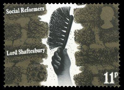
One of David Gentleman’s best pieces of design was the set of four honouring champions of reform in the spheres of factory exploitation, child labour, trade unionism and prison conditions.
Dark-hued and bleak, and cleverly showing hands set in very adverse situations, each stamp sums up in an instant what the problem was.
The 11p value highlights the cruel Victorian use of child chimney sweeps, evoking the soot-polluted environment of narrow, jagged, crumbling brickwork through which small boys were forced to crawl.
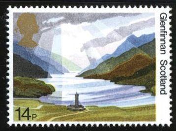
Fittingly, in a set which was issued expressly to mark the 50th anniversary of the National Trust for Scotland, the most evocative design is one of the two showing Scottish views.
Capturing the sunlight streaming down onto Loch Shiel, it highlights the desolate beauty of Glenfinnan, and the 60ft monument of a clansman which was raised in 1815 by Alexander MacDonald of Glenaladale to commemorate the start of the fateful last Jacobite rising in 1745.
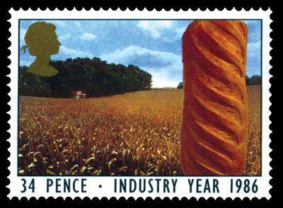
Industry Year was a campaign by the RSA (Royal Society for the Encouragement of Arts, Manufactures & Commerce) to promote and explain industry to the community.
Of the four stamps with a similar design concept, it’s the 34p that catches the eye.
It stars a mouth-watering loaf of crusty bread, well lit against a background of a vast field of corn, under blue skies.
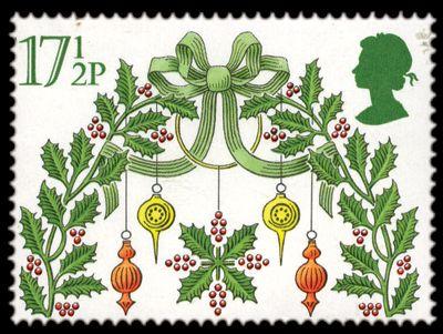
The 1980 set was among the most elegant of all Christmas issues, and the star of the group of five was the highest value, depicting a display of satin brocade and shining pendants with holly.
The arc of decorated foliage and the complete symmetry of the design suggest security and a welcoming door, beyond which are to be found many treats of the traditional British festive season.
With its deceptively simple design of green and red on white, this stamp epitomises Christmas, and has a very large ‘wow factor’.
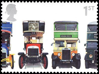
Available from counter sheets and miniature sheets, this set celebrating the 150th anniversary of the double-decker looks most striking in the former guise.
That’s because it comes in a se-tenant strip of five illustrating 16 buses, parked in a row as if lined up in a bus garage.
But of course you wouldn’t get so much historical variety in any normal bus garage.